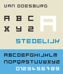
Architype Van Doesburg
 | |
| Category | Sans-serif |
|---|---|
| Classification | Geometric Sans-serif |
| Designer(s) |
Freda Sack David Quay Theo van DoesburgM |
| Foundry | The Foundry |
| Date created | 1919 |
| Date released | 1997 |
Architype Van Doesburg is a geometric sans-serif typeface based upon a 1919 alphabet designed by Theo van Doesburg, a cofounder of the De Stijl art movement. The digital revival shown at right was produced by Freda Sack and David Quay of The Foundry.
The face is constructed entirely of perpendicular evenly weighted strokes. Each character is based upon a square divided into a raster of 25 smaller squares. Van Doesburg's earliest uses of the alphabet was in limited quantity, made up of letterpress ruling pieces, and not as strictly formed as his more finished 1919 version. A similarly constructed rectilinear sans-serif typeface, designed in 1917 by Piet Zwart bears comparison. The face is similar to Van Doesburg's later 1928 alphabet designed for the Café Aubette in Strasbourg. Both faces anticipate later typographic explorations of geometric reductionism of Wim Crouwel's 1967 New Alphabet and early digital faces like Zuzana Licko's faces Lo-Res and Emperor 8. The Architype Van Doesburg typeface is part of a collection of several revivals of early twentieth century typographic experimentation designed by Freda Sack and David Quay of The Foundry.
References
- Friedl, Frederich, Nicholas Ott and Bernard Stein. Typography: An Encyclopedic Survey of Type Design and Techniques Through History. Black Dog & Leventhal: 1998. ISBN 1-57912-023-7.
- Hoek, Els, Marleen Blokhuis, Ingrid Goovaerts, Natalie Kamphuys, et al. Theo van Doesburg: Oeuvre Catalogus. Centraal Museum: 2000. ISBN 90-6868-255-5.
- Lupton, Ellen. Thinking with Type: A Critical Guide for Designers, Writers, Editors, & Students, Princeton Architectural Press: 2004. ISBN 1-56898-448-0.
- Strauss, Monica. Graphic Design and Typography in the Netherlands: A View of Recent Work, "Prelude: The Avant-Garde Trajectory in Holland." Princeton Architectural Press: 1992. ISBN 1-878271-62-8.