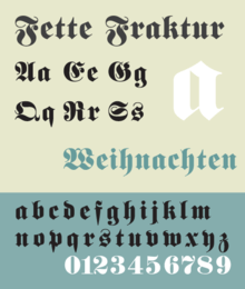
Fette Fraktur
 | |
| Category | Serif |
|---|---|
| Classification | Blackletter |
| Designer(s) | Johann Christian Bauer |
| Foundry | Bauer Type Foundry |
Fette Fraktur is a blackletter typeface of the sub-classification Fraktur designed by the German punchcutter Johann Christian Bauer (1802–1867) in 1850. The C.E. Weber Foundry published a version in 1875, and the D Stempel AG foundry published the version shown at right in 1908.
Fette Fraktur (German for bold Fraktur) is based on the Fraktur type of blackletter faces. This heavy nineteenth century version was developed more for advertising than text, similar to the extremely heavy advertising versions of Didone classification faces like Poster Bodoni, Thorogood, and Fat Face.
History
For a span of nearly a hundred years, the original Fraktur script was used as a standard text face in German-speaking Europe and parts of Scandinavia. During the period of the Third Reich Fraktur and blackletter faces were initially approved of in contrast to sans-serif faces (associated with the Bauhaus and cultural Bolshevism). Approved use of blackletter Fraktur faces by the Nazi regime continued until January 3, 1941, when Martin Bormann, director of the Party Chancellery issued a directive discontinuing the use of blackletter faces because of an alleged discovery of Jewish contributions in the development of these faces. Another reason may have been their limited legibility outside of Germany. While the Nazis forbade its use for practical and ideological reasons, at the conclusion of World War II, the Allied forces also prohibited it for a time because occupation troops could not read these faces. Eventually the ban on blackletter and Frakturs was lifted, but in Germany and Scandinavia the faces were largely replaced by the Antiqua (roman) alphabet.
Emotional reaction to association with the Third Reich, and a sense that the faces were outdated vestiges of the nineteenth century further reduced their use. Variants of Fraktur faces, such as Fette Fraktur, are however used in advertising and packaging to communicate a sense of traditional Austrian, Bavarian, or German flavor. In this modern decorative use the Fraktur rules about long s and short s or about ligatures are often disregarded, the knowledge of the old typographical conventions being lost.
Confusion with blackletter
Fette Fraktur and the regular Fraktur typeface have been confused for the blackletter script often mislabeled Old English script, and which has become extremely popular in the world of hip-hop music and fashion. Those forms of blackletter, however, derive from Textualis, not Fraktur, and have been influenced by the chicano urban culture of Los Angeles, California.
See also
References
- Blackwell, Lewis. 20th Century Type. Yale University Press: 2004. ISBN 0-300-10073-6.
- Bain, Peter and Paul Shaw. Blackletter: Type and National Identity. Princeton Architectural Press: 1998. ISBN 1-56898-125-2.
- Macmillan, Neil. An A–Z of Type Designers. Yale University Press: 2006. ISBN 0-300-11151-7.