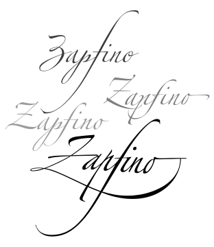
Zapfino
 | |
| Category | Formal script |
|---|---|
| Designer(s) | Hermann Zapf |
| Foundry | Linotype |
| Variations | Zapfino Extra |

Zapfino is a calligraphic typeface designed for Linotype by typeface designer Hermann Zapf in 1998. It is based on an alphabet Zapf originally penned in 1944. As a font, it makes extensive use of ligatures and character variations (for example, the lower case letter d has nine variations).
History
In 1983, Zapf had completed the typeface AMS Euler with Donald Knuth and David Siegel of Stanford University for the American Mathematical Society, a typeface for mathematical composition including fraktur and Greek letters. David Siegel had recently finished his studies at Stanford and was interested in entering the field of typography. He told Zapf his idea of making a typeface with a large number of glyph variations; he wanted to start with an example of Zapf's calligraphy that was reproduced in a publication by the Society of Typographical Arts in Chicago.
Zapf was concerned that this was the wrong way to go, and while he was interested in creating a complicated program, he was worried about starting something new. However, Zapf remembered a page of calligraphy from his sketchbook from 1944, and considered the possibility of making a typeface from it. He had previously tried to create a calligraphic typeface for Stempel in 1948, but hot metal composition was too limiting on the freedom of swash characters. Such a result could only be achieved using modern digital technology, and so Zapf and Siegel began work on the complicated software necessary. Siegel also hired Gino Lee, a type designer from Boston, Massachusetts, to render the extensive character set. (The "ino" in "Zapfino" refers to Gino.)
However, just before the project was completed, Siegel wrote a letter to Zapf, saying that his girlfriend had left him and that he had lost all interest in anything. Siegel abandoned the project and started a new life, working on bringing color to Macintosh computers and later becoming an Internet design expert.
Zapfino's development had become seriously delayed, until Zapf presented the project to Linotype. They were prepared to complete it and reorganized the project. Zapf worked with Linotype to create four alphabets and various ornaments, flourishes, and other dingbats. Zapfino was released in 1998 as a Type 1 font.
Availability
Apple Inc. includes Zapfino in Mac OS X and iOS, partly to demonstrate its advanced typographic features. The font includes over 1,400 glyphs as of the most recent version, and contains much bigger letters than the Zapfino fonts Linotype sells in retail channel. Since then, Linotype has extended Zapfino to include an additional Forte weight in their Zapfino Extra family which Apple has not licensed for distribution with Mac OS X.
Zapfino Extra (2003)
In 2003, Hermann Zapf completely reworked the Zapfino design, creating Zapfino Extra, a large expansion of the Zapfino family designed in close collaboration with Akira Kobayashi. This font family uses Apple Advanced Typography and OpenType technologies, allowing automatic ligatures and contextual glyph substitutions, accurately reflecting the fluid and dynamic nature of Zapf's calligraphy. This font family comes in 2 font weights, with 3 fonts in Forte weight and total of 12 fonts in the family. The Pro fonts contain glyphs found in other fonts of their respective weights.
Zapfino Extra W1G (2010)
It is a version Zapfino Extra with support of Greek and Cyrillic characters. The family includes Zapfino Extra Paneuropean W1G One font.
OpenType features include access all alternates, fractions, standard ligatures, localized forms, ordinals, scientific inferiors, superscript/subscript, discretionary ligatures.
Zapfino Extra Cyrillic One (2010)
It is a subset of Zapfino Extra Paneuropean W1G One font with only support of Cyrillic characters.[1]
Additional OpenType features include ornaments.
Zapfino Extra X (2003)
Linotype also created Zapfino Extra X, which was based on the 1998 Zapfino fonts included with Mac OS X. This font family, like the Zapfino in Mac OS X, features letters four times larger than the Linotype counterpart.
Atheism symbol

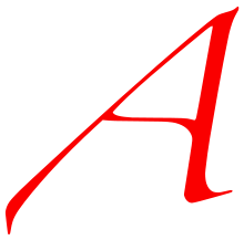
In various online communities, the scarlet-colored capital A in the Zapfino font has been used as an unofficial symbol representing atheism.[2] Officially, the "scarlet A" is used as the logo of the Out Campaign, a public awareness initiative for freethought and atheism, which has been endorsed by Richard Dawkins.[3]
See also
- Lucida Calligraphy: another calligraphic font using modern font programming to provide alternates, based on the writing of Ludovico Vicentino degli Arrighi.
References
- ↑ International typography gets a Cyrillic boost
- ↑ Mehta, Hemant (9 June 2015). "The Man Whose Font Was Used to Identify Atheists Worldwide Has Died". Friendly Atheist. Patheos. Retrieved 9 June 2015.
- ↑ "home". outcampaign.org. Retrieved 9 June 2015.
External links
- Zapfino Extra
- Linotype's description of Zapfino
- Zapfino Extra X Font Family - by Hermann Zapf
- There is no end: Omega and Zapfino - Article on Zapfino which includes comparison of typed text with and without ligatures as a flipbook